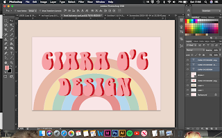
For the back of the cards, I wanted to use the same colours that were on the font and keep it really simple. So taking the two colours from the fonts and splitting them into the two block colours was the most effective way in doing so.
Landscape seemed to work better than portrait as the front of the cards were also landscape and would make much more sense for the person reading the business card.


No comments:
Post a Comment